Build Your HOA Website Free
Running an HOA is a big job for a volunteer.
Neighborhood.online gives your community a modern website, document storage, and communication tools in minutes.
No technical skills required.
HOA Website Examples: Ideas to Inspire Your Board

Updated September 16, 2026
Get a Head Start With Our Planning Template
Before you build, map out the pages and content your site needs. Our free HOA Website Planning Template walks you through it step by step, so nothing important gets left out.
Get the Planning TemplateWhen a board sets out to build or refresh its community site, the fastest way to get unstuck is to look at HOA website examples that already work. Seeing a real site makes the abstract concrete: you notice where the documents live, how dues get paid, and what makes a homepage feel welcoming instead of cluttered. This post walks through six real HOA website examples in depth, a few design and template ideas you can borrow, and the handful of traits the best HOA website examples all share, so your board can plan a site with confidence.
What Makes a Great HOA Website Example
A great HOA website is not about flashy design. It is about answering the questions residents and prospective buyers actually have, quickly and clearly. The best HOA website examples tend to do four things well: they welcome visitors, they make documents easy to find, they give an obvious way to pay dues or reach the board, and they look right on a phone. Keep those four jobs in mind as you look at the examples below.
A Real HOA Website Example: Burntwood West
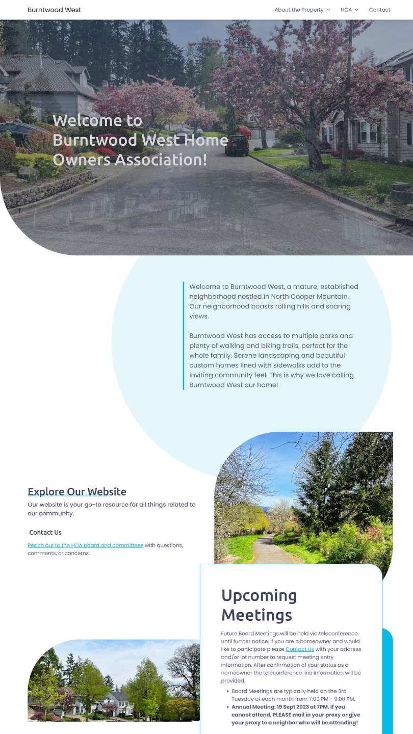
Burntwood West is a real, established neighborhood, and its site is a good example of a community website that keeps things simple and genuinely useful. The homepage opens with rotating photos of the neighborhood and a short, warm welcome, then gets straight to business.
What it does well:
- Clear navigation grouped into a few obvious sections: About the Property, HOA, News and Announcements, and Contact. A resident or a house hunter can find almost anything in a click or two.
- Board meetings front and center, with real meeting updates and a note about where to find the minutes.
- A News and Announcements section carrying actual, current notices, like dues invoices and reserve-contribution deadlines, so the site feels alive rather than abandoned.
- Quick-access cards for FAQs, the CC&Rs and bylaws document library, and a Realtors and Buyers page for people considering a home there.
- A Pay Dues link to a secure resident payment portal, plus clear contact details for both the board and the property manager.
None of this required a developer. Burntwood West is built on Neighborhood.online, so a volunteer board assembled the whole thing themselves. That is the real lesson of the example: a useful HOA website is well within reach for a self-managed community.
Another Real Example: Diamond B Ranch
Diamond B Ranch is a homeowners association in Cheyenne, Wyoming, and its site is a clean example of a community website that guides visitors instead of overwhelming them. The homepage opens with a welcoming photo and a short note that sets the tone: this is a place to stay connected with neighbors and informed about what is happening.
What stands out:
- An "Explore Our Website" row of feature cards right on the homepage, pointing visitors to News and Announcements, a Resources page of local businesses neighbors trust, the Document Library, and Contact. It answers "where do I go for what" before anyone has to think about it.
- A Document Library that spells out exactly what is inside: CC&Rs, bylaws, regulations, and meeting minutes.
- The same clear top navigation the best HOA sites use, grouped into About the Property, HOA, News, and Contact.
- A Board Meetings section with an open-door, all-neighbors-welcome tone that encourages residents to get involved.
- A Recent News feed that includes the announcement of the site's own launch, a small signal that the board is active and keeping things current.
Like Burntwood West, Diamond B Ranch runs on Neighborhood.online, which is how a volunteer board put together something this polished without hiring anyone.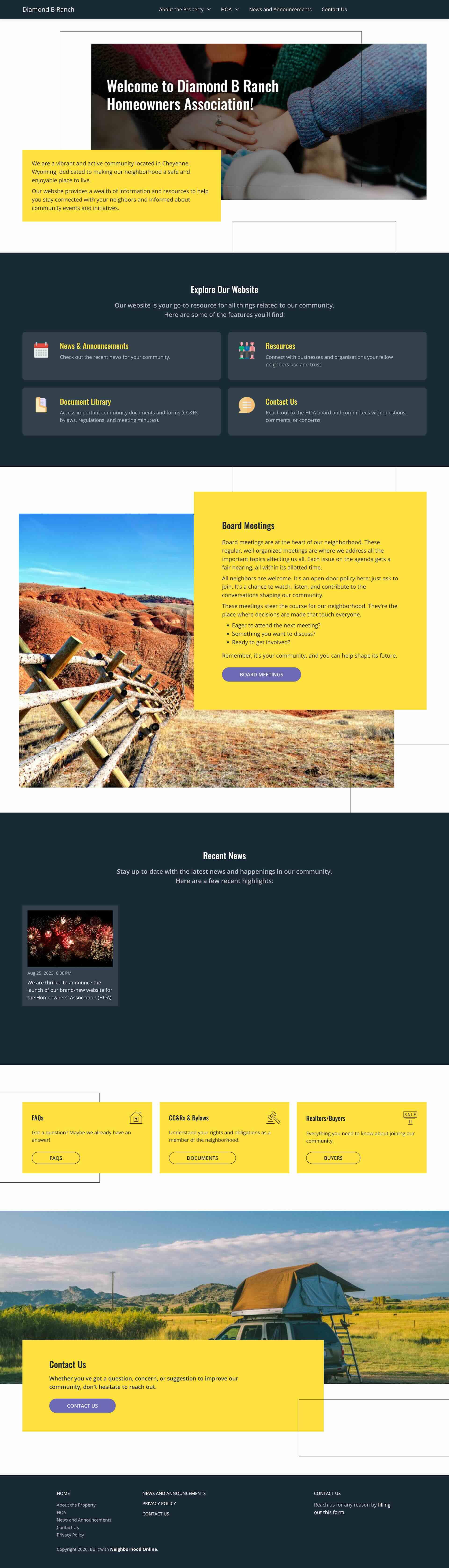
A Simple, Dues-Forward Example: Cove Creek
Cove Creek Estates in Taylor, Michigan, is proof that the smallest sites can be some of the most useful. The whole thing is just a handful of pages, HOA (with Report an Issue, Document Library, Board Members, and Pay Dues) and Contact, and it wastes none of them.
Why it works:
- It leads with the one thing homeowners most want to know: dues. The homepage lays out the annual amount, an early-bird discount for paying in full, an installment schedule with due dates, and the late fee, all in plain language. Nobody has to email the board to ask what they owe.
- A clever community touch: part of the dues can be earned back by helping on Neighborhood Cleanup Day, explained right alongside the payment details.
- A surprisingly deep Document Library for such a small site, with years of meeting minutes and even annual check registers posted openly. That kind of financial transparency is exactly what builds homeowner trust.
- A short, focused menu that gets residents to the documents, the board, and the payment page fast.
- Real neighborhood photos, including the community fountain, that make a small site feel welcoming.
Cove Creek is the model to copy if your association wants the least possible upkeep while still covering the essentials. It runs on Neighborhood.online.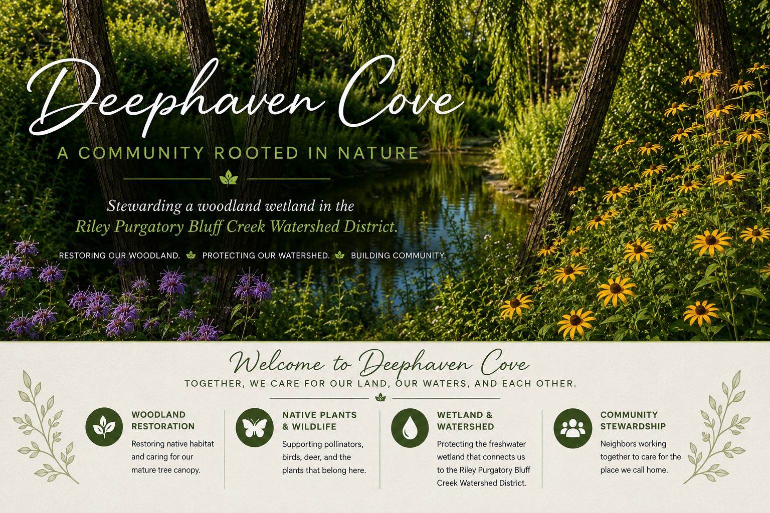
A Leaner Example: Magnolia Ridge
Magnolia Ridge, a phased community, shows that an HOA website example does not have to be big to be effective. Its navigation is pared down to the essentials: HOA, with Meetings, Dues, Document Library, and Board of Directors, plus News and Announcements and Contact. There are no filler pages to wade through.
What it gets right:
- It is actively used for real community business. The board runs things like elections and voting through the site, so residents find ballots and announcements in one place rather than scattered across email. This is not brochure-ware; it is a working tool.
- A dedicated Dues page right in the main menu, so paying is never more than one click away.
- The same easy "Explore Our Website" cards pointing visitors to News, the Document Library, and Contact.
- Real photos of the neighborhood instead of stock imagery, which makes the site feel like the community's own.
Magnolia Ridge is a strong model for a smaller or newer association that wants a focused, functional site without a lot of pages to maintain. Like the others, it runs on Neighborhood.online.
A Community-and-History Example: Deerfield
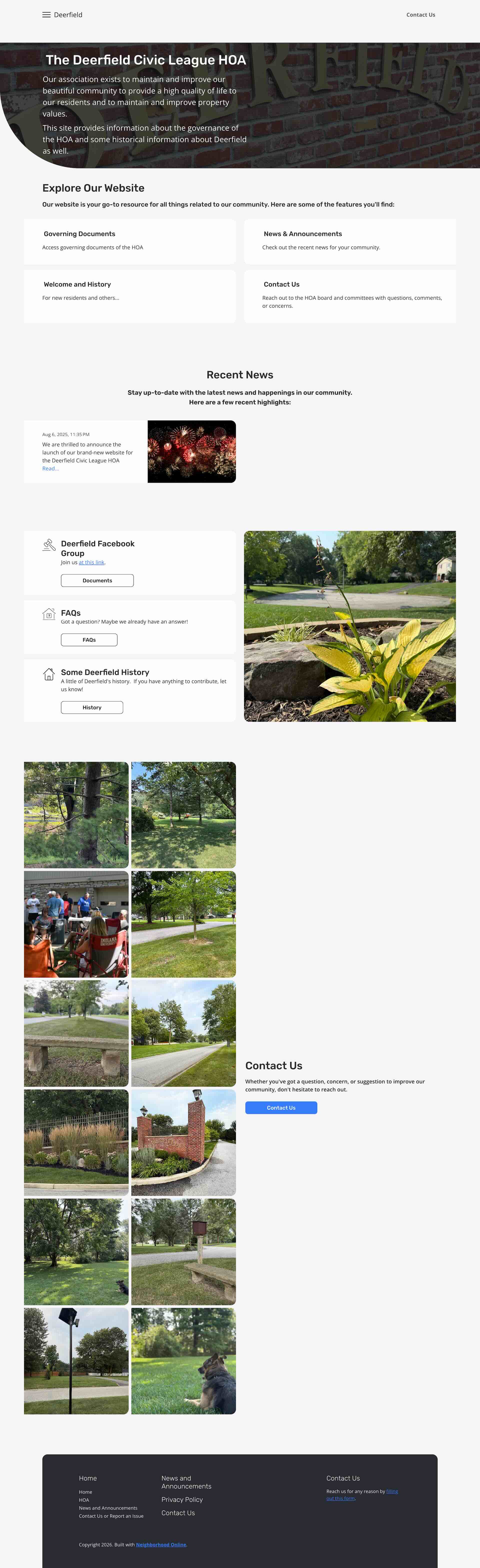
The Deerfield Civic League HOA is a good example of a site that balances governance with community character. It opens with a clear mission, to maintain and improve the community, quality of life, and property values, and then leans into what makes Deerfield feel like Deerfield.
What makes it stand out:
- A dedicated "Getting Approval for an Architectural Change" page, so homeowners know exactly how the architectural review process works before they start a project. That is one of the most-asked HOA questions, answered up front.
- Real neighborhood history and a Welcome and History section for new residents, which gives the site personality that most HOA sites lack.
- A photo-rich homepage using actual community pictures, including a neighborhood picnic, instead of stock images.
- A link to the community's private Facebook group, tying the official site together with where neighbors already chat.
- Practical governance pages all in one menu: Governing Documents, How to Pay Dues, Board Members, FAQs, and City and County Resources.
Deerfield is a strong model for an established community that wants its site to do double duty, handling HOA business while celebrating the neighborhood's identity. It runs on Neighborhood.online too.
A Transparency-First Example: Olde Hermitage
Olde Hermitage Association in Henrico County, Virginia, is a good example of a site that treats transparency and neighborliness as first-class features rather than afterthoughts.
Worth noticing:
- A dedicated Treasurer's Reports page right in the HOA menu, so the association's finances are a click away instead of buried. Few HOA sites make money matters this easy to find.
- A Neighborhood Directory and a Local Resources page of trusted businesses, which lean into the community side of an HOA rather than only the rules.
- A homepage that gets seasonal refreshes, an autumn theme when we looked, a small sign the board keeps the site current instead of setting it and forgetting it.
- Friendly, plain-language navigation, including a "Share a Concern" page instead of the usual stiff "report an issue" label.
Olde Hermitage is a good model for a board that wants its website to feel welcoming and open. Like the rest, it runs on Neighborhood.online.
More Communities to Explore
Want more HOA website examples to browse? These associations run on the same platform and are each worth a look:
- Riviera Apartments South, Hallandale Beach, Florida. A condo association that keeps its documents and announcements online, exactly the kind of setup Florida's condo website law expects.
- Deephaven Cove, a 28-home woodland townhome community in Minnesota on its own custom domain. Its FAQ page is a model of the format: clear, warm answers to real questions, from what the association maintains to how to join the garden, birding, and walking clubs.
- Harbor Point, a community whose board keeps its legal documents current, with the bylaws and a CC&R amendment both updated in 2026.
- Pelican Bay, a clean, simple site that uses real photos of the community and keeps documents and board contact a click away.
HOA Website Design Examples and Templates to Start From
You do not have to design from scratch. Starting from a template gives you the same structure the best examples use, ready to fill in with your own content. A calm, blue design suits communities that want a serene, welcoming feel, while a clean, professional layout with bold borders suits boards that prioritize clarity and easy navigation. Browse a few HOA website templates and picture your community's own photos and colors in them. These design examples are the quickest path from a blank page to a site that looks like a designer built it.
HOA Website Examples by Community Type
The right example depends on the kind of community you run. Here is what good looks like for three common types.
- Small self-managed HOAs. A 30 to 60 home community does not need much: a welcoming homepage, a document library for the CC&Rs and minutes, a contact form, and a way to pay dues. Among small HOA website examples, the ones that work keep the menu short and the homepage uncluttered.
- Large master associations. A bigger community with multiple amenities and sub-associations needs clearer navigation and usually a members-only resident portal. The best examples group pages logically so nobody has to hunt for the pool rules or the reservation form.
- Condo associations. Condo sites lean heavily on documents and compliance, since many states now require records to be posted online. A strong condo example puts the document library and board contact right up front.
What the Best HOA Website Examples Have in Common
Look at enough good HOA websites and the same design choices show up again and again:
- A homepage that names the community and welcomes visitors right away.
- A document library that is easy to find, so residents stop emailing the board for files.
- An obvious way to pay dues online and a clear place to contact the board.
- A mobile-friendly layout that looks right on a phone.
- A members-only area for anything residents should not have to share publicly.
- Fresh content, like recent news or upcoming meetings, so the site does not look abandoned.
How to Build a Site Like These
You do not need a designer or a developer to hit the marks in these examples. A dedicated HOA website builder gives you that structure ready to go, so a volunteer board can launch in an afternoon. Neighborhood.online, the platform behind the Burntwood West example above, offers a free plan with a website builder, document storage, and communication tools built specifically for HOAs. For a running start, our HOA website planning template and our complete guide to HOA websites and builders walk you through the pages and content to prepare first, and a clear navigation structure ties it all together.
The Bottom Line
The best HOA website examples share a simple goal: help residents and buyers find what they need without friction. Study the traits above, borrow a template that fits your community's feel, and start with the pages that matter most. Your next step is to pick a builder, spend twenty minutes setting up a real homepage, and see how quickly a useful community site comes together.