HOA Website Navigation
When designing a homeowners' association (HOA) website, the importance of a well-structured menu and intuitive navigation cannot be overstated. These elements are the backbone of a positive user experience, guiding community members effortlessly to the information and resources they need. A thoughtfully designed navigation system not only simplifies access to vital details but also fosters community engagement and participation.
Navigating a website should be straightforward and intuitive, especially for an HOA website, where timely access to information is crucial. Ever landed on a website and felt lost in the navigation maze? That's often the result of poor planning in communication, design, and site hierarchy. But worry not, adhering to best practices in website navigation can transform this experience significantly.
What is Website Navigation?
Website navigation is more than just a menu; it's the structural foundation of a website. It includes the top menu bar, footer links, and any sidebars. Effective navigation not only organizes content for users but also showcases the site's internal link architecture to search engines. This architecture acts as a roadmap, delineating the hierarchy and context of pages, and highlighting the most crucial information.
Why is Website Navigation Design Crucial for HOAs?
A well-thought-out navigation design benefits both the users (by guiding them effortlessly) and search engines (by clarifying your site's content). For an HOA, where information accessibility can directly impact community engagement and management efficiency, robust navigation can:
- Enhance search engine rankings and drive more traffic.
- Increase time spent on the site and page views.
- Improve overall user experience.
- Boost engagement and potentially on-site conversions.
Best Practices for Effective HOA Website Navigation
- Start with a Site Map: Begin by outlining all pages on your HOA website. Group them into categories and subcategories to define a clear hierarchy.
- Focus on User Needs: Your navigation should cater to what your residents and visitors are looking for. Ensure that essential pages like community rules, event calendars, and contact information are easily accessible.
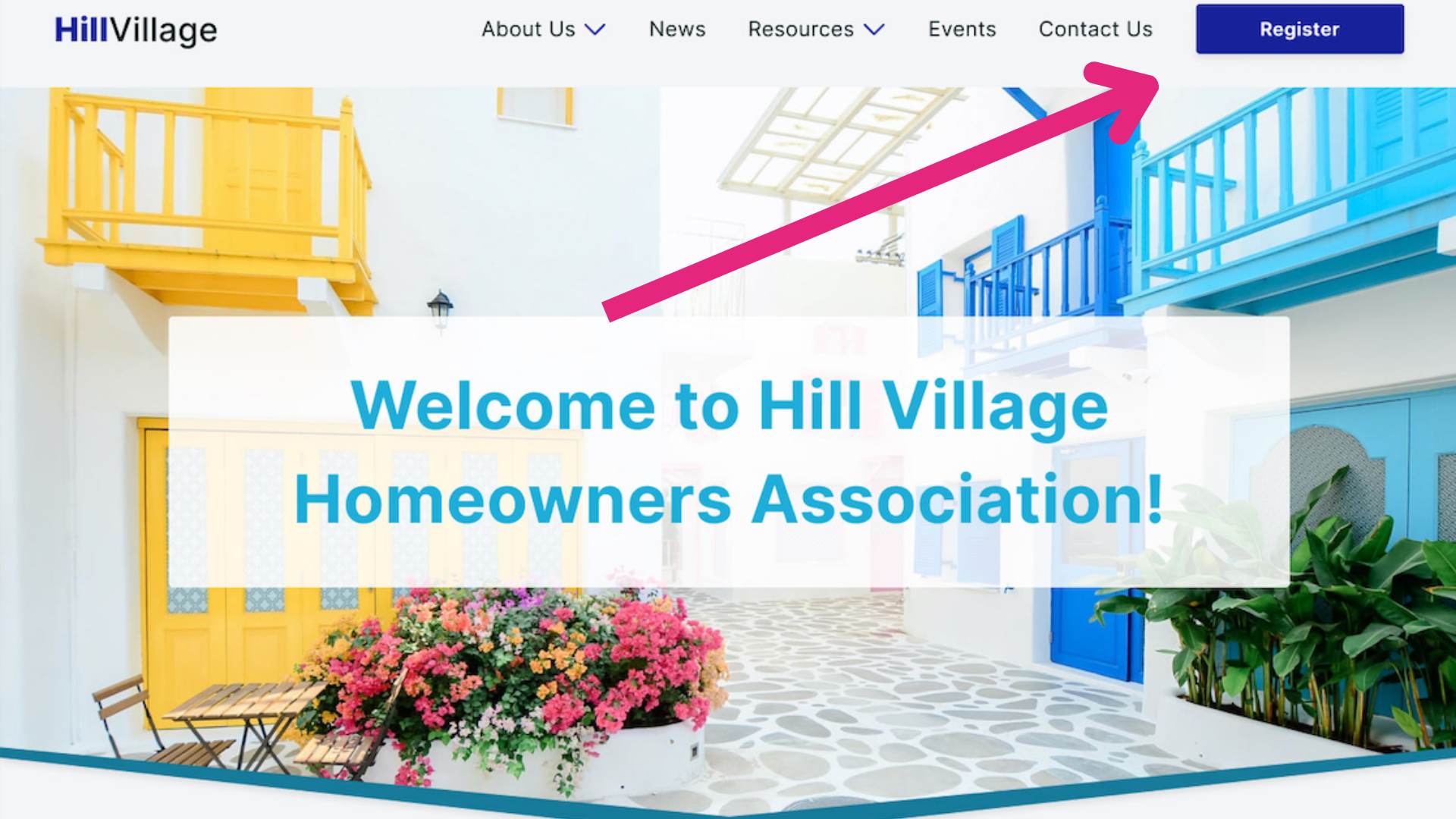
- Descriptive and Concise Menu Titles: Keep menu titles short yet descriptive enough for both users and search engines to understand what each page offers. Example:
- About
- News
- Resources
- Events
- Contact
Limit Top Navigation Items: Avoid overwhelming users with too many choices. Stick to essential items, ideally no more than seven in your main menu. 
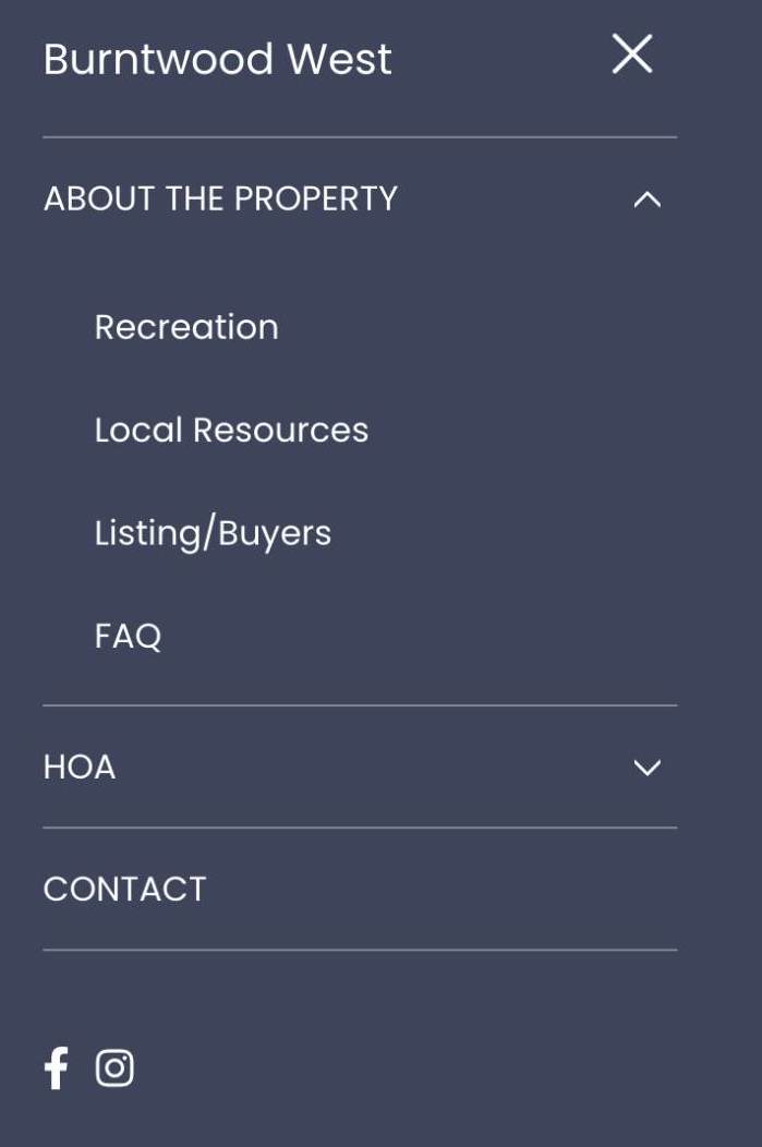
- Simple Dropdown Menus: If necessary, use dropdown menus, but keep them straightforward. Avoid multi-level dropdowns that can confuse users.
- Utilize 'Fat Footers' and 'Mega Menus' Wisely: If your site has extensive content, categorize and label them clearly in your footer or mega menus for easy navigation. Do not forget to add a link to your HOA Newsletter to the footer.

- Incorporate a Call-to-Action Button: Use your main navigation to highlight the primary action you want users to take, like contacting the board or reporting an issue.

- Sticky Top Navigation Menus: Consider a navigation bar that remains visible as users scroll, especially for essential pages and CTAs.
- Responsive Mobile Navigation: Ensure your navigation adapts well to mobile devices, keeping menus accessible and not overly cramped.

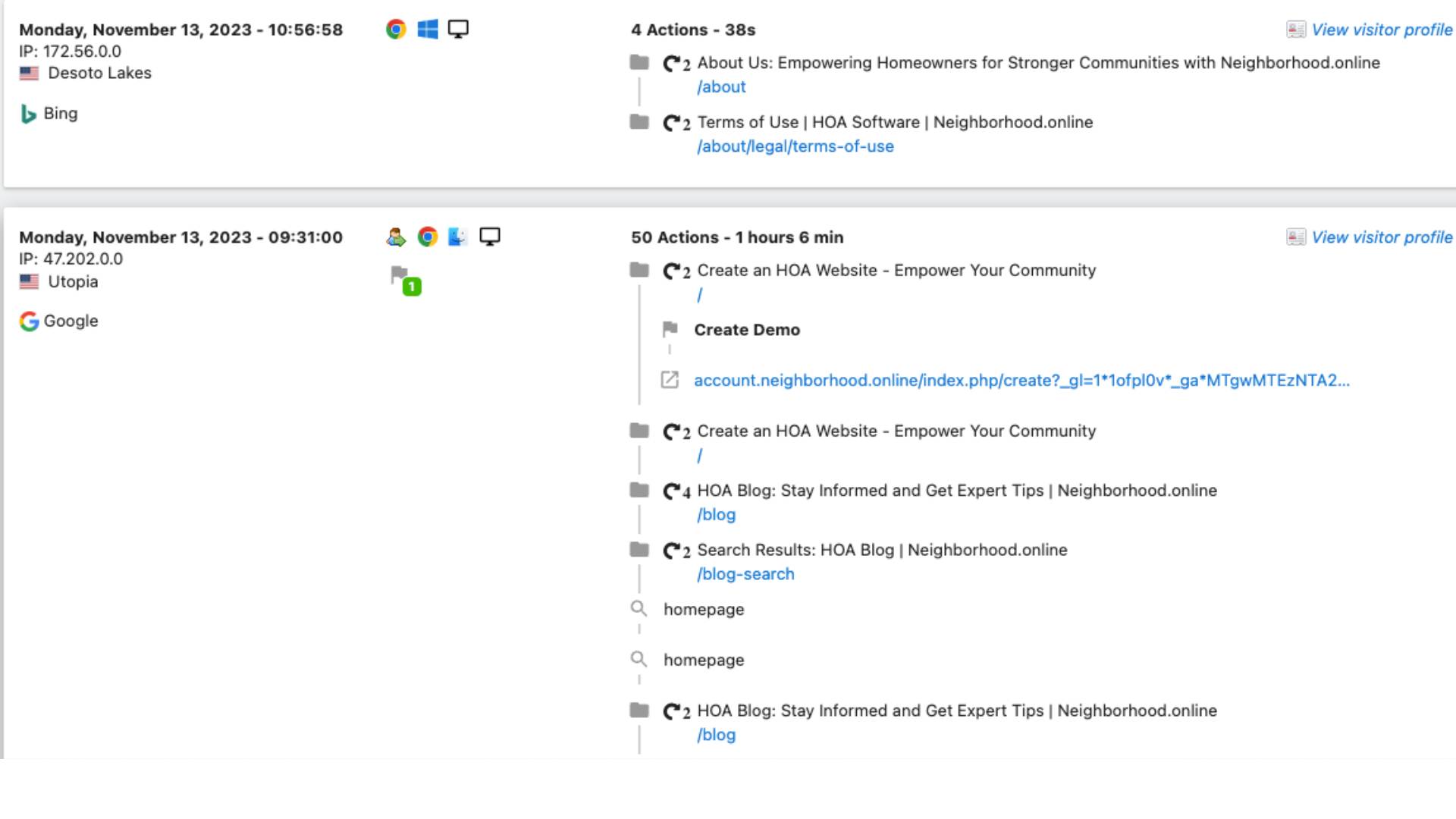
- Analyze and Adapt Using Analytics: Regularly review your site analytics to understand how users interact with your navigation. Make adjustments based on this data to continually improve the user experience.

Conclusion
Effective website navigation is a blend of thoughtful design, user-centric planning, and alignment with your HOA marketing strategy. For an HOA, where clear communication and community engagement are vital, these best practices can significantly enhance the online experience for residents and visitors alike.
Remember, while these guidelines provide a solid foundation, they should be tailored to the specific needs and characteristics of your community. Continuously testing and refining your navigation structure will ensure it remains effective and user-friendly.


